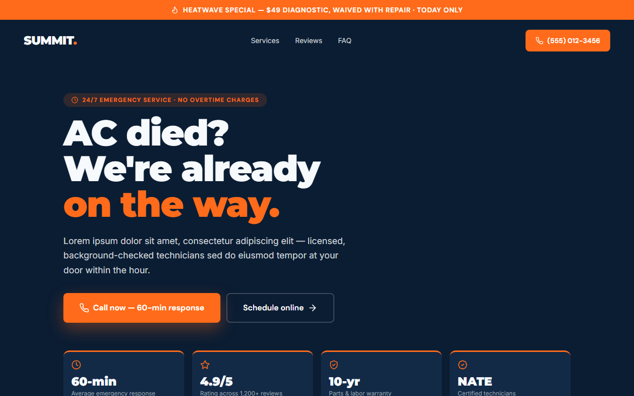
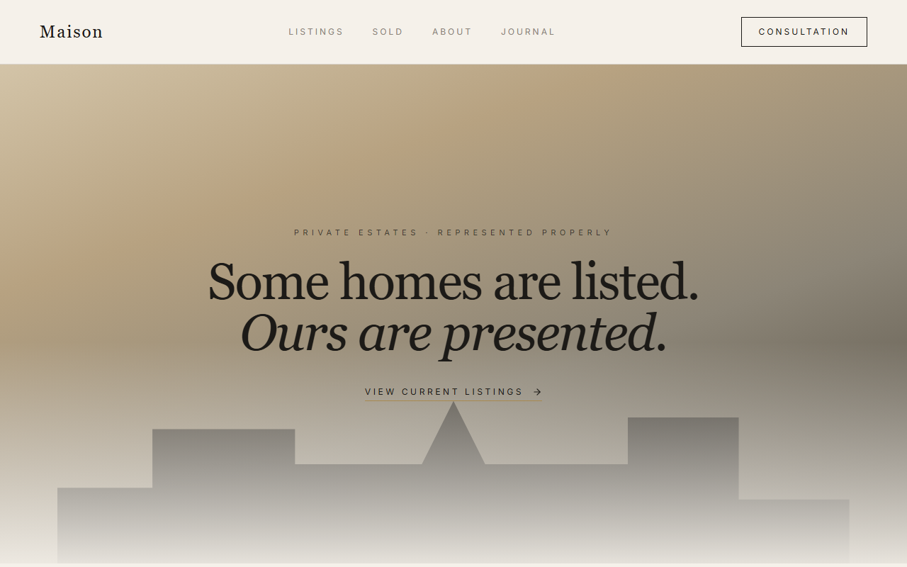
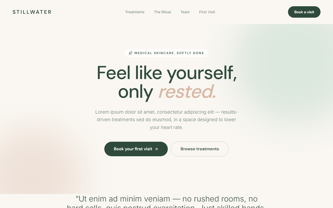
Civica starts from the truth that a resident visits a government site to do something (pay a bill, pull a permit, report a pothole), not to admire it. The hero is task-first, and popular services are grouped by intent rather than by the internal org chart that means nothing to the public.
Accessibility is the design, not a footnote. A single high-legibility civic typeface with WCAG contrast headroom, reduced-motion-first interactions, and plain-language labels meet the standard a public site is legally and morally held to, and, in the process, cut the confused phone calls that overload thin municipal staff.
A calm civic-navy palette and a prominent alert banner keep time-critical information first, while self-service task paths deflect routine volume from understaffed offices, the rare redesign that improves the resident experience and the budget at once.