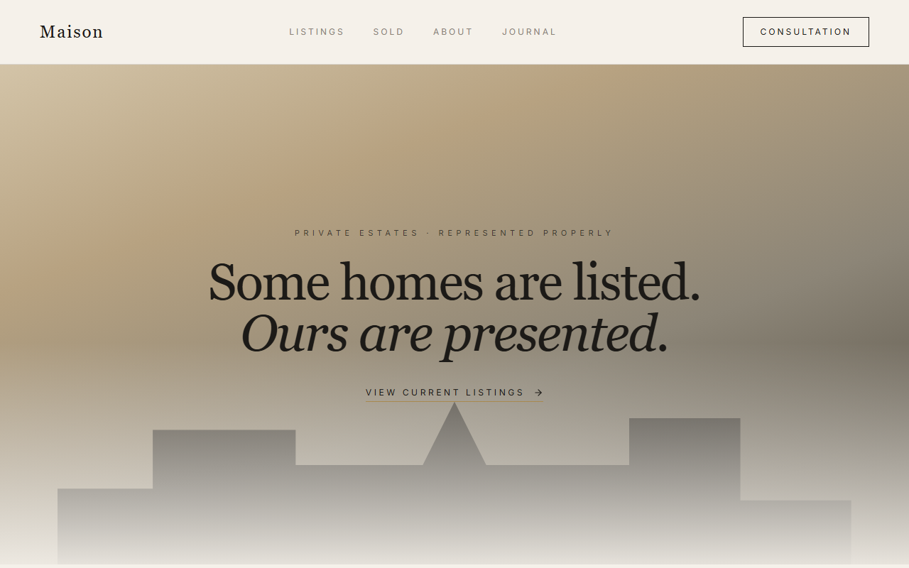
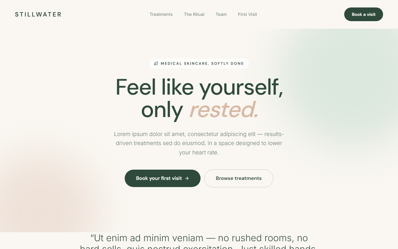
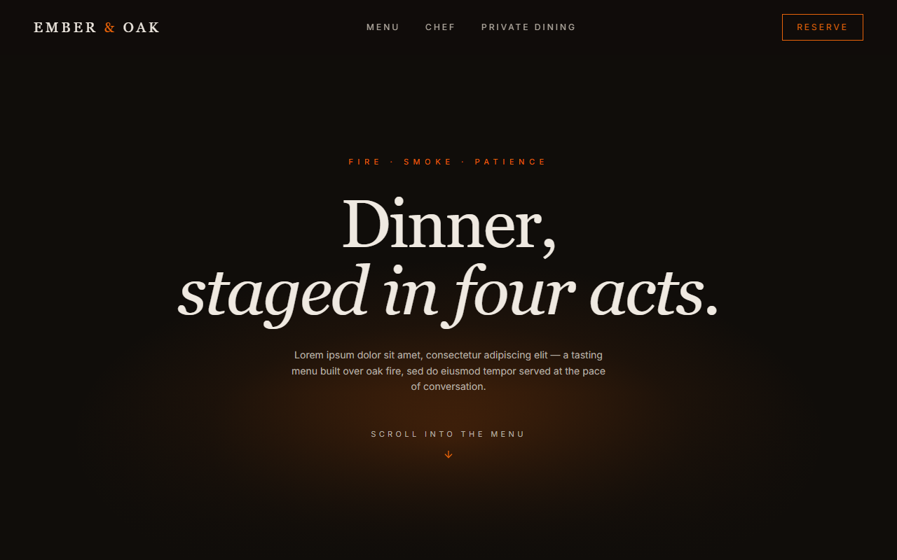
Summit is designed around one truth of the home-services market: when something breaks, people call the first company that looks trustworthy. The layout is a persuasion sequence, urgency, capability, proof, offer, objections, action, compressed into a page that reads in ninety seconds.
Visually it uses the boldest tool in the kit: contrast. A midnight-navy canvas makes the signal-orange CTAs impossible to miss, while heavy geometric display type gives every section headline the authority of a billboard. Motion is deliberately restrained to reveals and micro-feedback, because on a conversion page, animation serves scanning speed, not spectacle.
The build ships as prerendered static HTML, so the page paints instantly even on throttled mobile connections, where most emergency searches happen. Click-to-call, form webhooks, and ad conversion tagging are wired into the structure from day one.